TidyTuesday 2020 Week 28

#TidyTuesday 2020-07-07: Coffee Ratings.

R
TidyTuesday
tidymodels
machine learning
random forest
lasso
Author
Published

July 12, 2020

R setup
library(tidyverse)
library(tidytuesdayR)
library(gt)
library(rmarkdown)
library(patchwork)
library(ggtext)

library(dunnr)
extrafont::loadfonts(device = "win", quiet = TRUE)
theme_set(theme_td())
set_geom_fonts()
# A coffee themed palette I found here: https://colorpalettes.net/color-palette-4281/
coffee_pal <- c("#a0583c", "#c08267", "#ccb9b1", "#616063", "#212123")
options(ggplot2.discrete.color = coffee_pal,
        ggplot2.discrete.fill = coffee_pal)

Load the data

tt <- tidytuesdayR::tt_load("2020-07-07")

These data were scraped by James LeDoux in 2018 from the Coffee Quality Institute (see the original data here).

Data exploration

coffee <- tt$coffee_ratings

For my own convenience, I’ve copied data dictionary below:

variable class description
total_cup_points double Total rating/points (0 - 100 scale)
species character Species of coffee bean (arabica or robusta)
owner character Owner of the farm
country_of_origin character Where the bean came from
farm_name character Name of the farm
lot_number character Lot number of the beans tested
mill character Mill where the beans were processed
ico_number character International Coffee Organization number
company character Company name
altitude character Altitude - this is a messy column - I’ve left it for some cleaning
region character Region where bean came from
producer character Producer of the roasted bean
number_of_bags double Number of bags tested
bag_weight character Bag weight tested
in_country_partner character Partner for the country
harvest_year character When the beans were harvested (year)
grading_date character When the beans were graded
owner_1 character Who owns the beans
variety character Variety of the beans
processing_method character Method for processing
aroma double Aroma grade
flavor double Flavor grade
aftertaste double Aftertaste grade
acidity double Acidity grade
body double Body grade
balance double Balance grade
uniformity double Uniformity grade
clean_cup double Clean cup grade
sweetness double Sweetness grade
cupper_points double Cupper Points
moisture double Moisture Grade
category_one_defects double Category one defects (count)
quakers double quakers
color character Color of bean
category_two_defects double Category two defects (count)
expiration character Expiration date of the beans
certification_body character Who certified it
certification_address character Certification body address
certification_contact character Certification contact
unit_of_measurement character Unit of measurement
altitude_low_meters double Altitude low meters
altitude_high_meters double Altitude high meters
altitude_mean_meters double Altitude mean meters

A lot of variables to consider here. Summarize them with skimr:

skimr::skim(coffee)
Data summary
Name coffee
Number of rows 1339
Number of columns 43
_______________________
Column type frequency:
character 24
numeric 19
________________________
Group variables None

Variable type: character

skim_variable n_missing complete_rate min max empty n_unique whitespace
species 0 1.00 7 7 0 2 0
owner 7 0.99 3 50 0 315 0
country_of_origin 1 1.00 4 28 0 36 0
farm_name 359 0.73 1 73 0 571 0
lot_number 1063 0.21 1 71 0 227 0
mill 315 0.76 1 77 0 460 0
ico_number 151 0.89 1 40 0 847 0
company 209 0.84 3 73 0 281 0
altitude 226 0.83 1 41 0 396 0
region 59 0.96 2 76 0 356 0
producer 231 0.83 1 100 0 691 0
bag_weight 0 1.00 1 8 0 56 0
in_country_partner 0 1.00 7 85 0 27 0
harvest_year 47 0.96 3 24 0 46 0
grading_date 0 1.00 13 20 0 567 0
owner_1 7 0.99 3 50 0 319 0
variety 226 0.83 4 21 0 29 0
processing_method 170 0.87 5 25 0 5 0
color 218 0.84 4 12 0 4 0
expiration 0 1.00 13 20 0 566 0
certification_body 0 1.00 7 85 0 26 0
certification_address 0 1.00 40 40 0 32 0
certification_contact 0 1.00 40 40 0 29 0
unit_of_measurement 0 1.00 1 2 0 2 0

Variable type: numeric

skim_variable n_missing complete_rate mean sd p0 p25 p50 p75 p100 hist
total_cup_points 0 1.00 82.09 3.50 0 81.08 82.50 83.67 90.58 ▁▁▁▁▇
number_of_bags 0 1.00 154.18 129.99 0 14.00 175.00 275.00 1062.00 ▇▇▁▁▁
aroma 0 1.00 7.57 0.38 0 7.42 7.58 7.75 8.75 ▁▁▁▁▇
flavor 0 1.00 7.52 0.40 0 7.33 7.58 7.75 8.83 ▁▁▁▁▇
aftertaste 0 1.00 7.40 0.40 0 7.25 7.42 7.58 8.67 ▁▁▁▁▇
acidity 0 1.00 7.54 0.38 0 7.33 7.58 7.75 8.75 ▁▁▁▁▇
body 0 1.00 7.52 0.37 0 7.33 7.50 7.67 8.58 ▁▁▁▁▇
balance 0 1.00 7.52 0.41 0 7.33 7.50 7.75 8.75 ▁▁▁▁▇
uniformity 0 1.00 9.83 0.55 0 10.00 10.00 10.00 10.00 ▁▁▁▁▇
clean_cup 0 1.00 9.84 0.76 0 10.00 10.00 10.00 10.00 ▁▁▁▁▇
sweetness 0 1.00 9.86 0.62 0 10.00 10.00 10.00 10.00 ▁▁▁▁▇
cupper_points 0 1.00 7.50 0.47 0 7.25 7.50 7.75 10.00 ▁▁▁▇▁
moisture 0 1.00 0.09 0.05 0 0.09 0.11 0.12 0.28 ▃▇▅▁▁
category_one_defects 0 1.00 0.48 2.55 0 0.00 0.00 0.00 63.00 ▇▁▁▁▁
quakers 1 1.00 0.17 0.83 0 0.00 0.00 0.00 11.00 ▇▁▁▁▁
category_two_defects 0 1.00 3.56 5.31 0 0.00 2.00 4.00 55.00 ▇▁▁▁▁
altitude_low_meters 230 0.83 1750.71 8669.44 1 1100.00 1310.64 1600.00 190164.00 ▇▁▁▁▁
altitude_high_meters 230 0.83 1799.35 8668.81 1 1100.00 1350.00 1650.00 190164.00 ▇▁▁▁▁
altitude_mean_meters 230 0.83 1775.03 8668.63 1 1100.00 1310.64 1600.00 190164.00 ▇▁▁▁▁

Ratings

The key outcome variable is total_cup_points, which is a quality rating 0-100

p <- coffee %>%
  ggplot(aes(x = total_cup_points)) +
  geom_boxplot(y = 0, fill = coffee_pal[1], outlier.shape = NA) +
  geom_jitter(aes(y = 1), color = coffee_pal[2],
              alpha = 0.3, height = 0.3, width = 0) +
  remove_axis("y")
p

A very obvious outlier at total_cup_points = 0

coffee %>%
  filter(total_cup_points == min(total_cup_points)) %>%
  glimpse()
Rows: 1
Columns: 43
$ total_cup_points      <dbl> 0
$ species               <chr> "Arabica"
$ owner                 <chr> "bismarck castro"
$ country_of_origin     <chr> "Honduras"
$ farm_name             <chr> "los hicaques"
$ lot_number            <chr> "103"
$ mill                  <chr> "cigrah s.a de c.v."
$ ico_number            <chr> "13-111-053"
$ company               <chr> "cigrah s.a de c.v"
$ altitude              <chr> "1400"
$ region                <chr> "comayagua"
$ producer              <chr> "Reinerio Zepeda"
$ number_of_bags        <dbl> 275
$ bag_weight            <chr> "69 kg"
$ in_country_partner    <chr> "Instituto Hondureño del Café"
$ harvest_year          <chr> "2017"
$ grading_date          <chr> "April 28th, 2017"
$ owner_1               <chr> "Bismarck Castro"
$ variety               <chr> "Caturra"
$ processing_method     <chr> NA
$ aroma                 <dbl> 0
$ flavor                <dbl> 0
$ aftertaste            <dbl> 0
$ acidity               <dbl> 0
$ body                  <dbl> 0
$ balance               <dbl> 0
$ uniformity            <dbl> 0
$ clean_cup             <dbl> 0
$ sweetness             <dbl> 0
$ cupper_points         <dbl> 0
$ moisture              <dbl> 0.12
$ category_one_defects  <dbl> 0
$ quakers               <dbl> 0
$ color                 <chr> "Green"
$ category_two_defects  <dbl> 2
$ expiration            <chr> "April 28th, 2018"
$ certification_body    <chr> "Instituto Hondureño del Café"
$ certification_address <chr> "b4660a57e9f8cc613ae5b8f02bfce8634c763ab4"
$ certification_contact <chr> "7f521ca403540f81ec99daec7da19c2788393880"
$ unit_of_measurement   <chr> "m"
$ altitude_low_meters   <dbl> 1400
$ altitude_high_meters  <dbl> 1400
$ altitude_mean_meters  <dbl> 1400

All of the gradings (aroma, flavor, etc.) are also 0. Remove it:

coffee <- coffee %>% filter(total_cup_points > 0)
p %+% coffee

Show the distribution of the other numerical gradings:

coffee %>%
  select(aroma:moisture) %>%
  pivot_longer(cols = everything()) %>%
  ggplot(aes(x = value)) +
  geom_boxplot(y = 0, fill = coffee_pal[1], outlier.shape = NA) +
  geom_jitter(aes(y = 1), color = coffee_pal[2],
              alpha = 0.3, height = 0.3, width = 0) +
  remove_axis("y") +
  facet_wrap(~name, ncol = 3)

None of the values are missing, and they all seem to range from 0 to 10, except for moisture:

coffee %>%
  ggplot(aes(x = moisture)) +
  geom_boxplot(y = 0, fill = coffee_pal[1], outlier.shape = NA) +
  geom_jitter(aes(y = 1), color = coffee_pal[2],
              alpha = 0.3, height = 0.3, width = 0) +
  remove_axis("y")

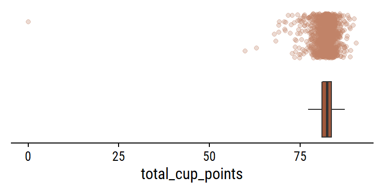
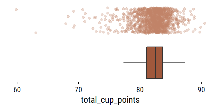
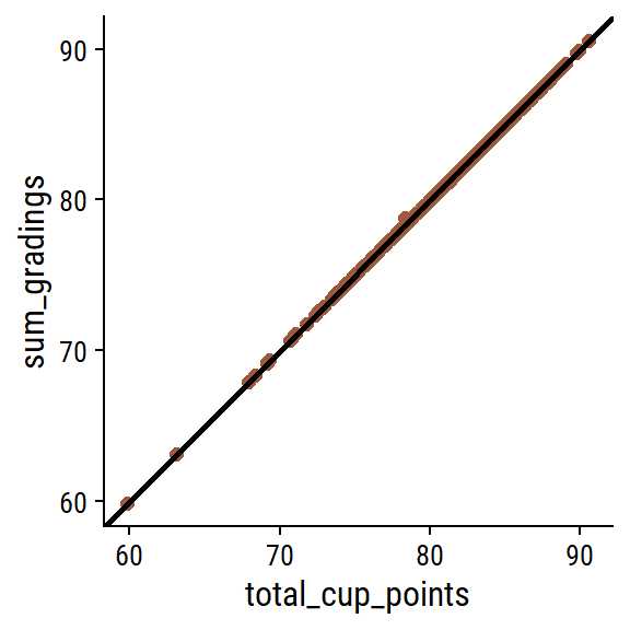
What is the relationship between the individual gradings and the overall total_cup_points? There are 10 gradings with scores 0-10, so I assume adding them together gives total_cup_points, which ranges 0-100:

coffee %>%
  rowwise() %>%
  transmute(
    total_cup_points,
    sum_gradings = sum(c_across(aroma:cupper_points))
  ) %>%
  ggplot(aes(x = total_cup_points, y = sum_gradings)) +
  geom_point(color = coffee_pal[1], size = 2) +
  geom_abline(size = 1)

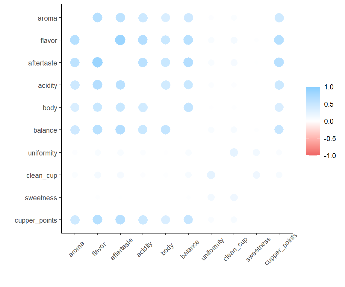
Some very slight deviations, but yes my assumption is correct. A second assumption: there will be mostly positive associations among the individual gradings (e.g. a coffee with high flavor will have high body on average). Compute and plot the pairwise correlations with corrr:

coffee %>%
  select(aroma:cupper_points) %>%
  corrr::correlate(method = "pearson", use = "everything") %>%
  corrr::rplot() +
  theme(axis.text.x = element_text(angle = 45, vjust = 0.7))

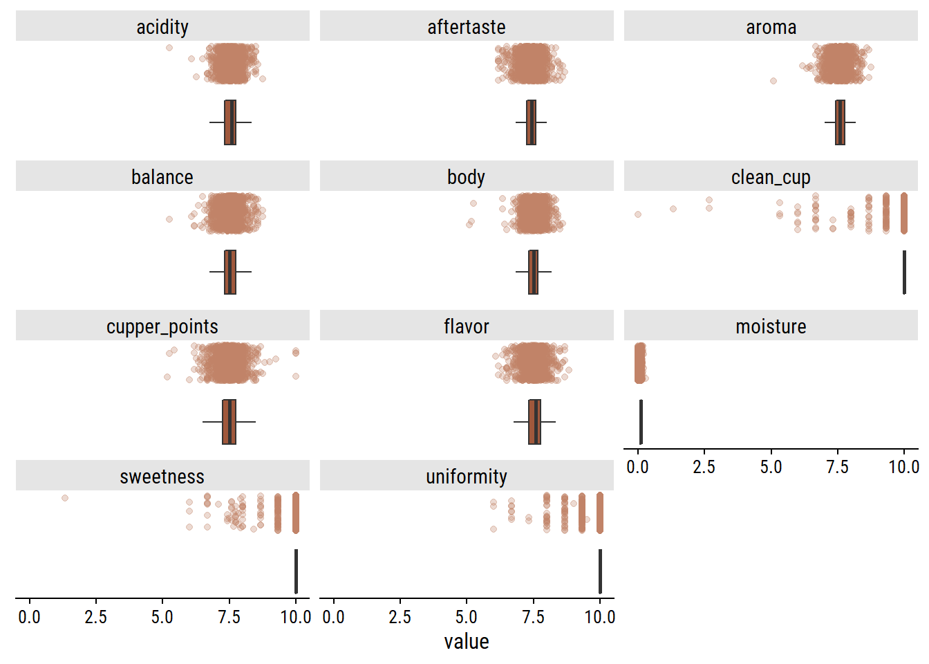
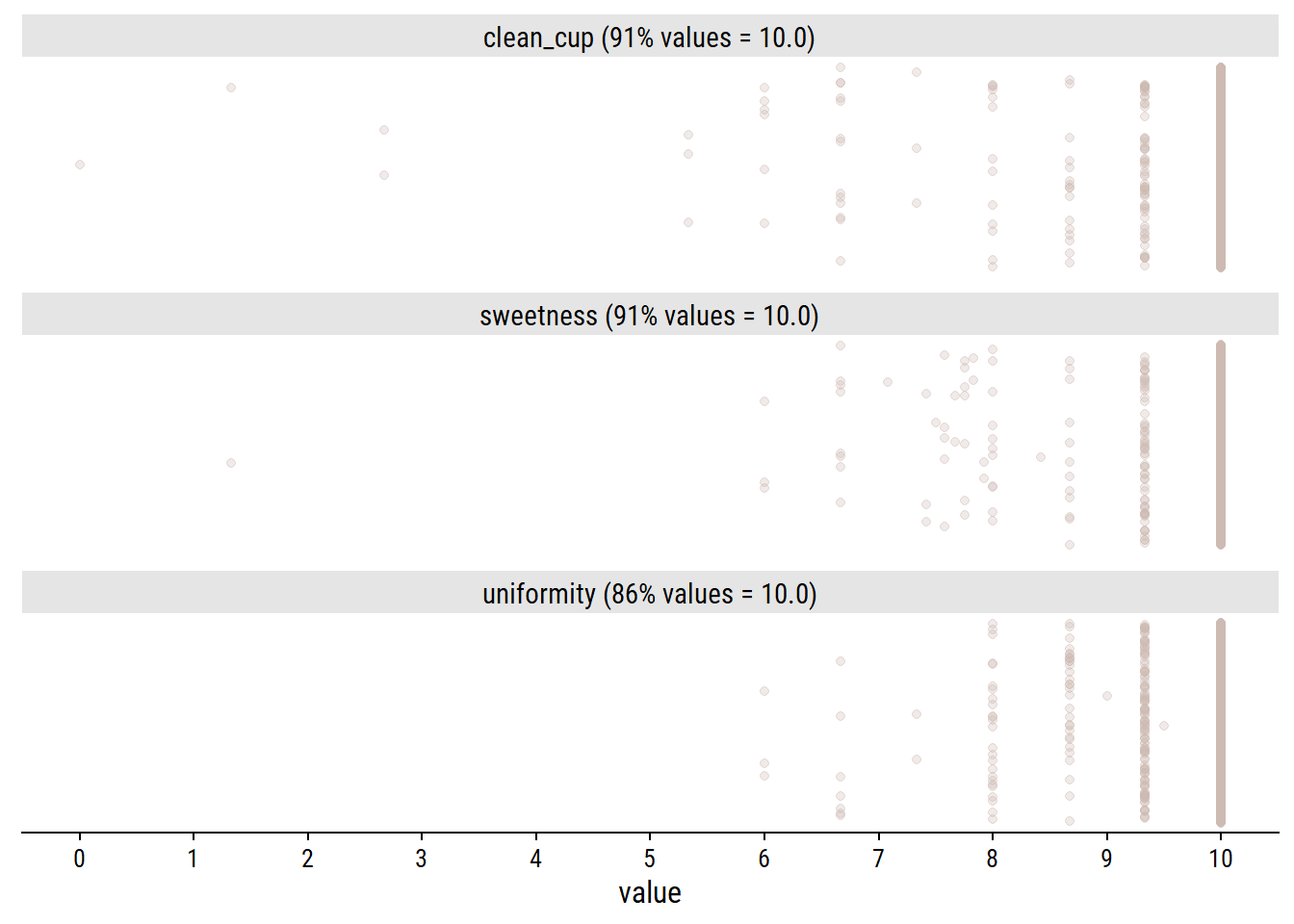
Yes, lots of high correlations. Interestingly, there are three variables in particular (uniformity, clean_cup and sweetness) which correlate moderately with eachother, and weakly with the others. These happen to be the gradings that are almost always 10:

coffee %>%
  select(uniformity, clean_cup, sweetness) %>%
  pivot_longer(everything()) %>%
  group_by(name) %>%
  mutate(
    name = glue::glue(
      "{name} ({scales::percent(mean(value == 10))} values = 10.0)"
    )
  ) %>%
  ggplot(aes(x = value, y = 1)) +
  geom_jitter(alpha = 0.3, width = 0, color = coffee_pal[3]) +
  facet_wrap(~name, ncol = 1) +
  remove_axis("y") +
  scale_x_continuous(breaks = 0:10)

Categorical variables

There are two species, though Arabica makes up the large majority:

coffee %>% count(species)
# A tibble: 2 × 2
  species     n
  <chr>   <int>
1 Arabica  1310
2 Robusta    28

Interesting that Arabica makes up 98% of the data, but ~60% of the coffee produced worldwide, so seems to be over-represented here.

There are 36 countries of origin (1 value missing):

coffee %>%
  count(country_of_origin, sort = TRUE) %>%
  mutate(
    country_of_origin = country_of_origin %>%
      fct_explicit_na() %>%
      fct_reorder(n)
  ) %>%
  ggplot(aes(y = country_of_origin, x = n)) +
  geom_col(fill = coffee_pal[1]) +
  scale_x_continuous(expand = expansion(mult = c(0, 0.1))) +
  labs(y = NULL)

For the most frequent countries, show the distribution of overall ratings:

coffee %>%
  mutate(
    country_of_origin  = country_of_origin %>%
      fct_explicit_na() %>%
      fct_lump(n = 10) %>%
      fct_reorder(total_cup_points)
  ) %>%
  ggplot(aes(y = country_of_origin, x = total_cup_points)) +
  geom_boxplot(fill = coffee_pal[3]) +
  labs(y = NULL)

Ethiopian coffee has a very clear lead in terms of ratings, while Colombia has very consistently high ratings.

coffee %>%
  mutate(
    variety = variety %>%
      fct_explicit_na() %>%
      fct_lump_min(10, other_level = "Other (n<10)")
  ) %>%
  count(variety) %>%
  mutate(variety = fct_reorder(variety, n)) %>%
  ggplot(aes(y = variety, x = n)) +
  geom_col(fill = coffee_pal[2]) +
  scale_x_continuous(expand = expansion(mult = c(0, 0.1))) +
  labs(y = NULL)

There are two unknown values for variety: “Other” and NA (Missing). These could have different meanings (e.g. an NA value could be a common variety but is just missing) but I will combine both:

coffee <- coffee %>%
  mutate(variety = ifelse(variety == "Other", NA_character_, variety))

in_country_partner has a manageable number of unique values (27)

d <- coffee %>%
  mutate(
    in_country_partner = fct_lump(in_country_partner, 10)
  ) %>%
  add_count(in_country_partner) %>%
  mutate(in_country_partner = fct_reorder(in_country_partner, n))
p1 <- d %>%
  distinct(in_country_partner, n) %>%
  ggplot(aes(y = in_country_partner, x = n)) +
  geom_col(fill = coffee_pal[1]) +
  scale_x_continuous(expand = expansion(mult = c(0, 0.1))) +
  labs(y = NULL)
p2 <- d %>%
  ggplot(aes(y = in_country_partner, x = total_cup_points)) +
  geom_boxplot(fill = coffee_pal[2]) +
  labs(y = NULL) +
  theme(axis.text.y = element_blank())
p1 | p2

The coffee bean color is presumably before roasting:

d <- coffee %>%
  add_count(color) %>%
  mutate(color = fct_reorder(color, n))
p1 <- d %>%
  distinct(color, n) %>%
  ggplot(aes(y = color, x = n)) +
  geom_col(fill = coffee_pal[1]) +
  scale_x_continuous(expand = expansion(mult = c(0, 0.1))) +
  labs(y = NULL)
p2 <- d %>%
  ggplot(aes(y = color, x = total_cup_points)) +
  geom_boxplot(fill = coffee_pal[2]) +
  labs(y = NULL) +
  theme(axis.text.y = element_blank())
p1 | p2

harvest_year could use some data processing:

d %>%
  count(harvest_year, sort = T) %>%
  paged_table()

For values like “2013/2014” and “2010-2011, I’ll extract the first year.

coffee <- coffee %>%
  mutate(
    harvest_year_num = harvest_year %>%
      str_extract("\\d{4}") %>%
      as.numeric()
  )
coffee %>%
  count(harvest_year, harvest_year_num, sort = T) %>%
  paged_table()

It doesn’t work with values like “08/09” because they are not 4 digits, but those values are very low frequency.

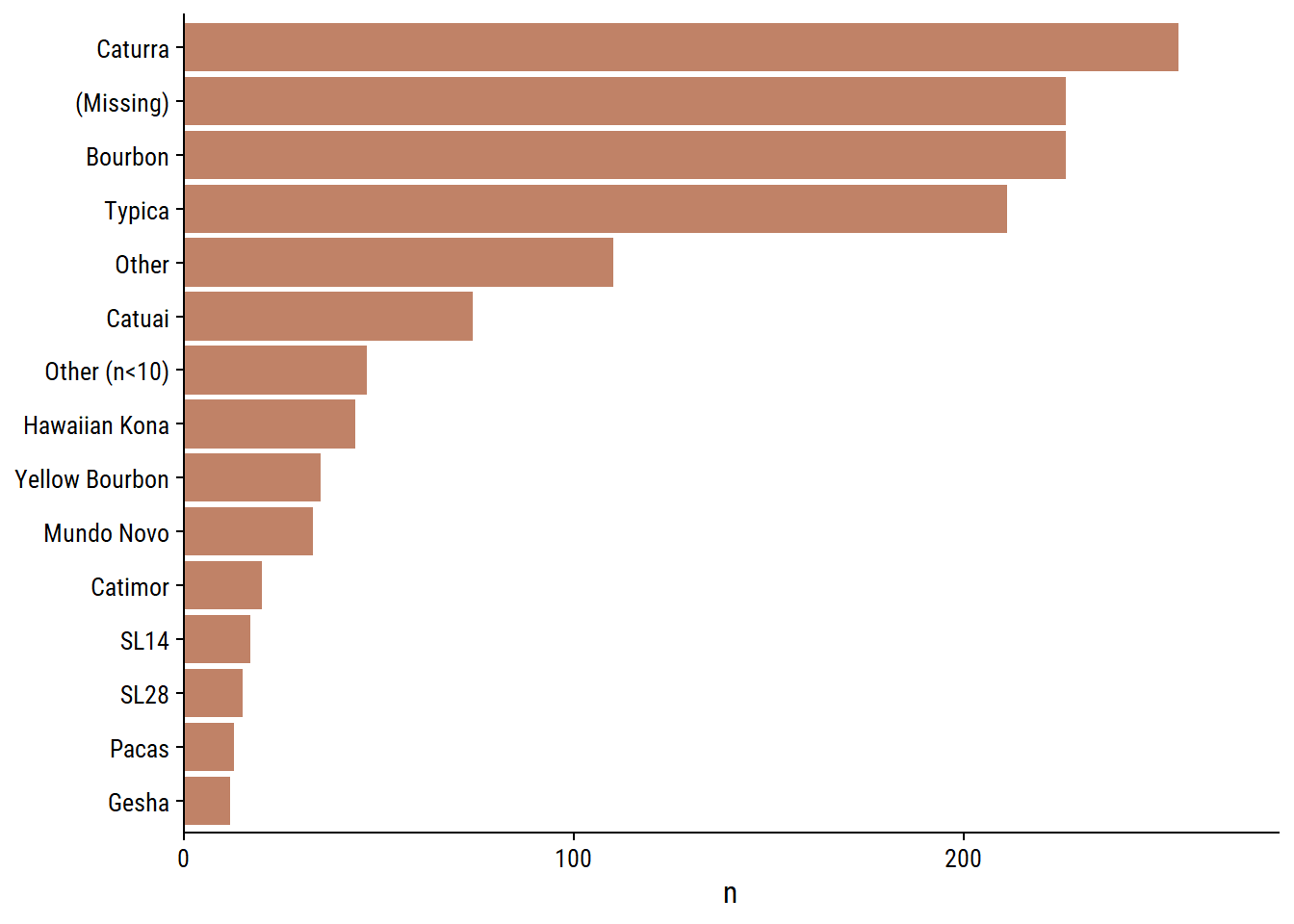
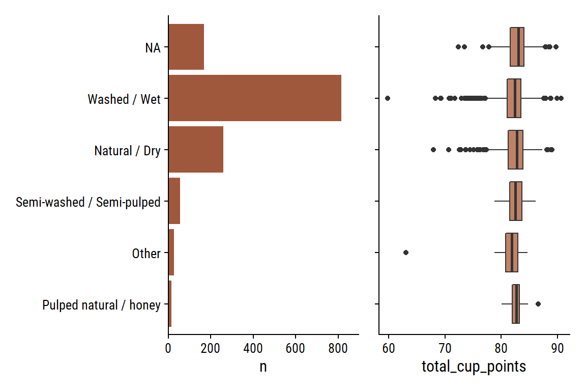
The 5 processing_methods:

d <- coffee %>%
  add_count(processing_method) %>%
  mutate(processing_method = fct_reorder(processing_method, n))
p1 <- d %>%
  distinct(processing_method, n) %>%
  ggplot(aes(y = processing_method, x = n)) +
  geom_col(fill = coffee_pal[1]) +
  scale_x_continuous(expand = expansion(mult = c(0, 0.1))) +
  labs(y = NULL)
p2 <- d %>%
  ggplot(aes(y = processing_method, x = total_cup_points)) +
  geom_boxplot(fill = coffee_pal[2]) +
  labs(y = NULL) +
  theme(axis.text.y = element_blank())
p1 | p2

There are two date variables that I think would be interesting to compare: grading_date and expiration. Parse them as date objects and compute the difference in days:

coffee <- coffee %>%
  mutate(
    # Convert both to date objects
    expiration = lubridate::mdy(expiration),
    grading_date = lubridate::mdy(grading_date)
  )
coffee %>%
  mutate(
    days_from_expiration = expiration - grading_date
  ) %>%
  count(days_from_expiration)
# A tibble: 1 × 2
  days_from_expiration     n
  <drtn>               <int>
1 365 days              1338

Every single grading was (supposedly) done 365 days before expiration. Maybe it is standard procedure that gradings be done exactly one year before expiration. Not sure, but this unfortunately makes it an uninteresting variable for exploration/modeling.
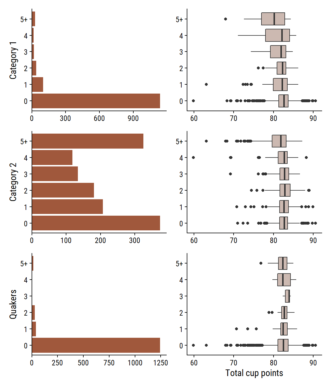
Defects

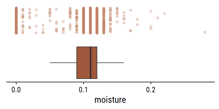
There are two defect variables (category_one_defects and category_two_defects) and the quakers variable, which are immature/unripe beans.

d <- coffee %>%
  mutate(
    across(
      c(category_one_defects, category_two_defects, quakers),
      # Group counts above 5 together
      ~cut(., breaks = c(0:5, 100), include.lowest = TRUE, right = FALSE,
           labels = c(0:4, "5+"))
    )
  ) %>%
  select(where(is.factor), total_cup_points) %>%
  pivot_longer(cols = -total_cup_points,
               names_to = "defect", values_to = "n_defects") %>%
  filter(!is.na(n_defects))

p1 <- d %>%
  filter(defect == "category_one_defects") %>%
  ggplot(aes(y = n_defects)) +
  geom_bar(fill = coffee_pal[1]) +
  scale_x_continuous(NULL, expand = expansion(c(0, 0.05)))
p2 <- d %>% 
  filter(defect == "category_one_defects") %>%
  ggplot(aes(y = n_defects, x = total_cup_points)) +
  geom_boxplot(fill = coffee_pal[3]) +
  labs(x = NULL, y = NULL)


(
  (p1 + labs(y = "Category 1") | p2)
) /
  (
    (p1 %+% filter(d, defect == "category_two_defects") +
       labs(y = "Category 2") |
       p2 %+% filter(d, defect == "category_two_defects"))
  ) /
  (
    (p1 %+% filter(d, defect == "quakers") +
       labs(y = "Quakers", x = "Count") |
       (p2 %+% filter(d, defect == "quakers") +
          labs(x = "Total cup points")))
  )

Looks to be a slight decline in ratings with increasing category 1 and 2 defects. Not much of an effect with number of quakers.

Altitude

The altitude variable is messy, but looks like it was cleaned via the altitude_*_variables:

coffee %>%
  count(
    altitude, altitude_mean_meters, altitude_low_meters, altitude_high_meters,
    unit_of_measurement, sort = T
  ) %>%
  paged_table()

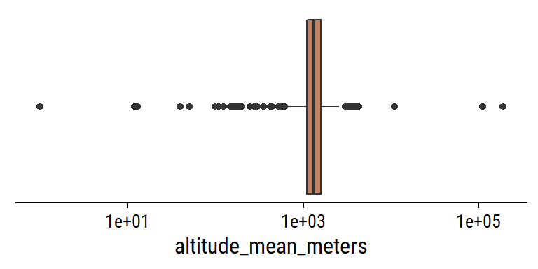
There are some unit conversions from feet to meters, for example:

coffee %>%
  filter(unit_of_measurement == "ft", !is.na(altitude)) %>%
  count(altitude, unit_of_measurement, altitude_mean_meters, sort = T) %>%
  # Re-calculate the altitude in feet to see if it matches
  mutate(feet_manual = altitude_mean_meters * 3.28) %>%
  paged_table()

And re-calculating the altitude in feet, everything looks to be correctly converted.

Look for any obvious outliers:

coffee %>%
  filter(!is.na(altitude_mean_meters)) %>%
  ggplot(aes(x = altitude_mean_meters)) +
  geom_boxplot(y = 0, fill = coffee_pal[2]) +
  scale_x_log10() +
  remove_axis("y")

Yes, some pretty clear ones. Look at values larger than 3000:

coffee %>%
  select(country_of_origin, altitude, unit_of_measurement,
         altitude_mean_meters) %>%
  arrange(desc(altitude_mean_meters)) %>%
  filter(altitude_mean_meters > 2000) %>%
  gt()
country_of_origin altitude unit_of_measurement altitude_mean_meters
Guatemala 190164 m 190164
Guatemala 1901.64 m 190164
Nicaragua 1100.00 mosl m 110000
Brazil 11000 metros m 11000
Myanmar 4287 m 4287
Myanmar 4001 m 4001
Colombia 1800 meters (5900 m 3850
Myanmar 3845 m 3845
Myanmar 3825 m 3825
Myanmar 3800 m 3800
Indonesia 3500 m 3500
Guatemala 3280 m 3280
India 3170 m 3170
India 3140 m 3140
India 3000' m 3000
United States 3000' m 3000
Colombia 2.560 msnm m 2560
Colombia 2560 m 2560
Colombia 2527 m 2527
Malawi 2500m m 2500
Tanzania, United Republic Of 2285 m 2285
Colombia 2136 msnm m 2136
United States meters above sea level: 2.112 m 2112
Guatemala 2100 m 2100
United States meters above sea level: 2.080 m 2080
Ethiopia 1950-2200 m 2075
United States meters above sea level: 2.019 m 2019

Some helpful frames of reference:

  • The elevation of Everest is 8849m.
  • The highest point in Guatemala is Tajumulco volcano at 4220m.
  • One of the Myanmar coffee producers claims here that their beans are grown at 4000-7000 ft -> 1200-2200m
  • Coffee elevations by country:
    • Brazil: 1300-5300 ft -> 400-1600 meters
    • Guatemala: 3900-6200 ft -> 1200-1900 meters
    • Colombia: 2600-6200 ft -> 800-1900 meters

Besides the obvious errors (e.g. 190164 meters), my guess is that many of these measurements are still in feet and need to be converted to meters.

A couple decimal values were incorrectly processed:

coffee %>%
  filter(str_detect(altitude, regex("sea", ignore_case = T))) %>%
  select(matches("altitu")) %>%
  gt()
altitude altitude_low_meters altitude_high_meters altitude_mean_meters
meters above sea level: 1.872 1872 1872 1872
meters above sea level: 1.943 1943 1943 1943
meters above sea level: 2.080 2080 2080 2080
meters above sea level: 2.019 2019 2019 2019
meters above sea level: 2.112 2112 2112 2112
meters above sea level: 1.941 1941 1941 1941
800 meters above sea level 800 800 800
1600 + meters above sea level 1600 1600 1600
1400 meter above sea level 1400 1400 1400

Look at some of the lowest values:

coffee %>%
  select(country_of_origin, altitude, unit_of_measurement,
         altitude_mean_meters, producer, country_of_origin) %>%
  arrange(desc(altitude_mean_meters)) %>%
  filter(altitude_mean_meters <= 10) %>%
  gt()
country_of_origin altitude unit_of_measurement altitude_mean_meters producer
Kenya -1 m 1 NA
Brazil 1 m 1 Ipanema Agrícola SA

These are almost certainly incorrect, but there are so few values, I won’t worry about them.

Make a value of “fixed” mean altitude:

coffee <- coffee %>%
  mutate(
    altitude_mean_meters_fixed = case_when(
      altitude == "1800 meters (5900" ~ 1800,
      altitude_mean_meters == 190164 ~ 1901,
      altitude_mean_meters == 110000 ~ 1100,
      str_detect(altitude, "^meters above") ~ altitude_mean_meters / 1000.0,
      # Assume anything above 3000 needs to be converted from feet
      altitude_mean_meters > 3000 ~ 0.3048 * altitude_mean_meters,
      TRUE ~ altitude_mean_meters
    )
  )
coffee %>%
  filter(!is.na(altitude_mean_meters_fixed)) %>%
  ggplot(aes(x = altitude_mean_meters_fixed)) +
  geom_boxplot(y = 0, fill = coffee_pal[2]) +
  remove_axis("y")

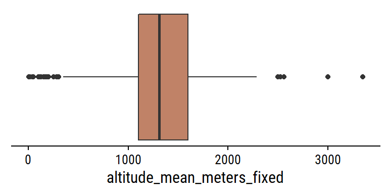
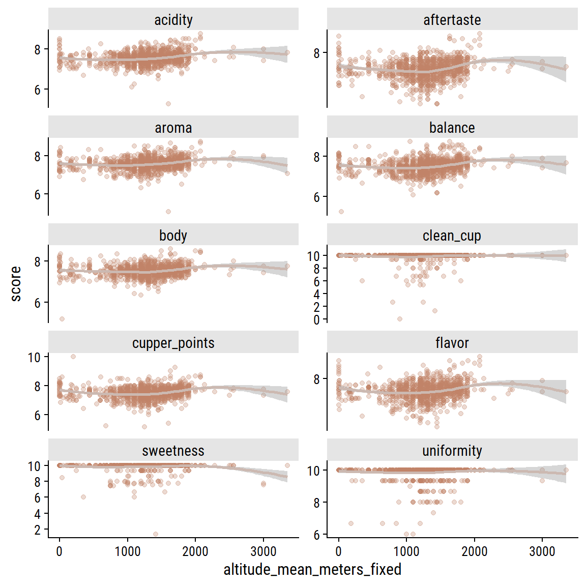
That is looking a bit better. Plot the relationship between the uni-dimensional ratings and mean altitude:

coffee %>%
  select(aroma:cupper_points, altitude_mean_meters_fixed) %>%
  filter(!is.na(altitude_mean_meters_fixed)) %>%
  pivot_longer(cols = -altitude_mean_meters_fixed,
               names_to = "grading", values_to = "score") %>%
  ggplot(aes(x = altitude_mean_meters_fixed, y = score)) +
  geom_point(alpha = 0.3, color = coffee_pal[2]) +
  geom_smooth(method = "loess", formula = "y ~ x", color = coffee_pal[3]) +
  facet_wrap(~grading, ncol = 2, scales = "free_y") +
  scale_y_continuous(breaks = seq(0, 10, 2))

The ratings are so clustered around the 6-9 range, it is hard to see much of a relationship but there does seem to be a small bump in ratings around 1500-2000 meters for a few of the variables. Can we see it in total scores?
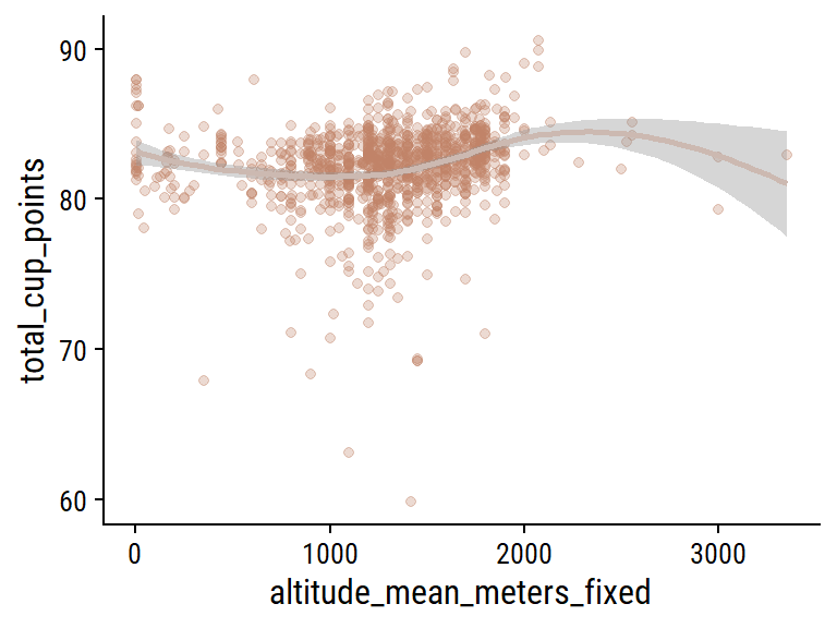
coffee %>%
  filter(!is.na(altitude_mean_meters_fixed)) %>%
  ggplot(aes(x = altitude_mean_meters_fixed, y = total_cup_points)) +
  geom_point(alpha = 0.3, color = coffee_pal[2]) +
  geom_smooth(method = "loess", formula = "y ~ x", color = coffee_pal[3]) +
  scale_y_continuous(breaks = seq(0, 100, 10))

Yes, there looks to be the range of altitudes with the highest ratings on average.

Model

I want to attempt to predict scores for one of the individual gradings (not the 0-100 total score, or the three that are mostly 10s), which I will choose randomly:

set.seed(74)
sample(
  c("aroma", "flavor", "aftertaste", "acidity", "body",
    "balance", "cupper_points"),
  size = 1
)
[1] "flavor"

flavor it is. I’ll attempt to predict it with the following:

  • Categorical: species, country_of_origin, processing_method, color, in_country_partner, variety
  • Numerical: aroma, flavor, aftertaste, acidity, body, balance, uniformity, clean_cup, sweetness, cupper_points, moisture, category_one_defects, category_two_defects, quakers, altitude_mean_meters_fixed

Load tidymodels, split the data 3:1 into training and testing (stratified by the outcome flavor), and define the resampling strategy:

# Some minor pre-processing
coffee <- coffee %>%
  mutate(
    variety = fct_explicit_na(variety),
    across(where(is.character), factor)
  )

library(tidymodels)
set.seed(42)
coffee_split <- initial_split(coffee, prop = 3/4, strata = flavor)
coffee_train <- training(coffee_split)
coffee_test <- testing(coffee_split)

coffee_resamples <- vfold_cv(coffee_train, v = 5, strata = flavor)

Now define the recipe:

  • Impute the mode for missing categorical values
  • Lump together categorical values with <5% frequency
  • Impute the mean for missing numerical values
  • Standardize all numerical predictors (important for lasso regularization)
  • Given its non-linear relationship, use splines in the altitude_mean_meters_fixed predictor
coffee_rec <-
  recipe(
    flavor ~
      species + country_of_origin + processing_method + color +
      in_country_partner + variety + aroma + aftertaste + acidity + body +
      balance + uniformity + clean_cup + sweetness + cupper_points + moisture +
      category_one_defects + category_two_defects + quakers +
      altitude_mean_meters_fixed,
    data = coffee_train
  ) %>%
  # Where missing, impute categorical variables with the most common value
  step_impute_mode(all_nominal_predictors()) %>%
  # Some of these categorical variables have too many levels, group levels
  #  with <5% frequency 
  step_other(country_of_origin, variety, in_country_partner, processing_method,
             threshold = 0.05) %>%
  # These two numerical predictors have some missing value, so impute with mean
  step_impute_mean(quakers, altitude_mean_meters_fixed) %>%
  # Normalize (0 mean, 1 SD) all numerical predictors
  step_normalize(all_numeric_predictors()) %>%
  # Use splines in the altitude variable to capture it's non-linearity.
  step_ns(altitude_mean_meters_fixed, deg_free = 4) %>%
  # Finally, create the dummy variables (note that this step must come *after*
  #  normalizing numerical variables)
  step_dummy(all_nominal_predictors())
coffee_rec
Recipe

Inputs:

      role #variables
   outcome          1
 predictor         20

Operations:

Mode imputation for all_nominal_predictors()
Collapsing factor levels for country_of_origin, variety, in_country_partner,...
Mean imputation for quakers, altitude_mean_meters_fixed
Centering and scaling for all_numeric_predictors()
Natural splines on altitude_mean_meters_fixed
Dummy variables from all_nominal_predictors()

Before applying the recipe, we can explore the processing steps with the recipes::prep() and recipes::bake() functions applied to the training data:

coffee_baked <- bake(prep(coffee_rec), new_data = NULL)
coffee_baked %>% paged_table()

And before fitting any models, register parallel computing to speed up the tuning process:

# Speed up the tuning with parallel processing
n_cores <- parallel::detectCores(logical = FALSE)
library(doParallel)
cl <- makePSOCKcluster(n_cores - 1)
registerDoParallel(cl)

Linear regression

Start simple, with just a linear regression model:

lm_spec <- linear_reg() %>%
  set_engine("lm")
lm_workflow <- workflow() %>%
  add_recipe(coffee_rec) %>%
  add_model(lm_spec)
lm_fit_train <- lm_workflow %>%
  fit(data = coffee_train)
lm_fit <- last_fit(lm_fit_train, coffee_split)

collect_metrics(lm_fit)
# A tibble: 2 × 4
  .metric .estimator .estimate .config             
  <chr>   <chr>          <dbl> <chr>               
1 rmse    standard       0.144 Preprocessor1_Model1
2 rsq     standard       0.819 Preprocessor1_Model1

Show the actual vs predicted flavor in the testing data:

collect_predictions(lm_fit) %>%
  ggplot(aes(x = flavor, y = .pred)) +
  geom_point(color = coffee_pal[1], alpha = 0.5) +
  geom_abline(slope = 1, intercept = 0, size = 1.5)

Linear regression does great, which makes me think that the more complicated models to follow will be overkill.

Lasso regression

We will tune (i.e. allow the penalty term \(\lambda\) to vary) a lasso regression model to see if it can outperform a basic linear regression:

lasso_spec <- linear_reg(penalty = tune(), mixture = 1) %>%
  set_engine("glmnet")

# Define the lambda values to try when tuning
lasso_lambda_grid <- grid_regular(penalty(), levels = 50)

lasso_workflow <- workflow() %>%
  add_recipe(coffee_rec) %>%
  add_model(lasso_spec)

library(tictoc) # A convenient package for timing
tic()
lasso_tune <-
  tune_grid(
    lasso_workflow,
    resamples = coffee_resamples,
    grid = lasso_lambda_grid
  )
toc()
1.69 sec elapsed
show_best(lasso_tune, metric = "rmse")
# A tibble: 5 × 7
   penalty .metric .estimator  mean     n std_err .config              
     <dbl> <chr>   <chr>      <dbl> <int>   <dbl> <chr>                
1 0.00356  rmse    standard   0.149     5 0.00417 Preprocessor1_Model38
2 0.00222  rmse    standard   0.149     5 0.00417 Preprocessor1_Model37
3 0.00569  rmse    standard   0.149     5 0.00427 Preprocessor1_Model39
4 0.00139  rmse    standard   0.149     5 0.00416 Preprocessor1_Model36
5 0.000869 rmse    standard   0.149     5 0.00414 Preprocessor1_Model35

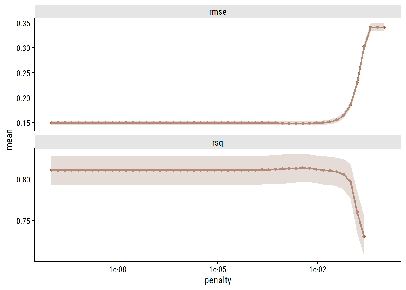
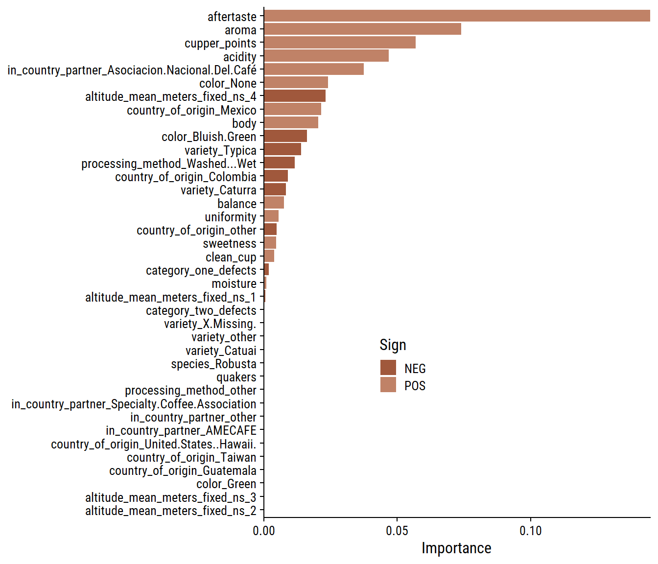
Lasso regression was un-needed in this case, as it did not perform differently than basic linear regression. We can see this by looking at the behaviour of the metrics with \(\lambda\):

collect_metrics(lasso_tune) %>%
  ggplot(aes(x = penalty, y = mean)) +
  geom_line(size = 1, color = coffee_pal[1]) +
  geom_point(color = coffee_pal[1]) +
  geom_ribbon(aes(ymin = mean - std_err, ymax = mean + std_err),
              alpha = 0.5, fill = coffee_pal[3]) +
  facet_wrap(~.metric, ncol = 1, scales = "free_y") +
  scale_x_log10()

Lower levels of regularization gave better metrics. Regardless, finalize the workflow.

lasso_best_workflow <- lasso_workflow %>%
  finalize_workflow(select_best(lasso_tune, metric = "rmse"))
lasso_fit <- last_fit(lasso_best_workflow, coffee_split)

collect_metrics(lasso_fit)
# A tibble: 2 × 4
  .metric .estimator .estimate .config             
  <chr>   <chr>          <dbl> <chr>               
1 rmse    standard       0.143 Preprocessor1_Model1
2 rsq     standard       0.822 Preprocessor1_Model1

Also look at variable importance:

library(vip)
lasso_fit %>%
  extract_fit_engine() %>%
  vi(
    # This step seems to be necessary for glmnet objects
    lambda =  select_best(lasso_tune, metric = "rmse")$penalty
  ) %>%
  mutate(Variable = fct_reorder(Variable, Importance)) %>%
  ggplot(aes(x = Importance, y = Variable, fill = Sign)) +
  geom_col() +
  scale_x_continuous(expand = c(0, 0)) +
  labs(y = NULL) +
  theme(legend.position = c(0.3, 0.3))

Random forest

Lastly, try a random forest model:

ranger_spec <- rand_forest(mtry = tune(), min_n = tune(), trees = 1000) %>%
  set_mode("regression") %>%
  # The importance argument allows us to compute variable importance afterwards
  set_engine("ranger", importance = "permutation")

ranger_workflow <- workflow() %>%
  add_recipe(coffee_rec) %>%
  add_model(ranger_spec)

set.seed(12)

tic()
ranger_tune <-
  tune_grid(ranger_workflow, resamples = coffee_resamples, grid = 11)
i Creating pre-processing data to finalize unknown parameter: mtry
toc()
22.39 sec elapsed

Tuning results:

show_best(ranger_tune, metric = "rmse")
# A tibble: 5 × 8
   mtry min_n .metric .estimator  mean     n std_err .config              
  <int> <int> <chr>   <chr>      <dbl> <int>   <dbl> <chr>                
1    20    17 rmse    standard   0.148     5 0.00543 Preprocessor1_Model08
2    17    22 rmse    standard   0.149     5 0.00555 Preprocessor1_Model02
3    26    13 rmse    standard   0.149     5 0.00522 Preprocessor1_Model10
4     6     7 rmse    standard   0.149     5 0.00591 Preprocessor1_Model04
5    30    11 rmse    standard   0.150     5 0.00509 Preprocessor1_Model01

And plotting those same results:

autoplot(ranger_tune) +
  add_facet_borders()

We see that (besdies that first point) the tuning process did not amount to significantly improved metrics. Choose the best and fit to the test data:

ranger_best <- ranger_workflow %>%
  finalize_workflow(select_best(ranger_tune, metric = "rmse"))
ranger_fit <- last_fit(ranger_best, coffee_split)
collect_metrics(ranger_fit)
# A tibble: 2 × 4
  .metric .estimator .estimate .config             
  <chr>   <chr>          <dbl> <chr>               
1 rmse    standard       0.137 Preprocessor1_Model1
2 rsq     standard       0.839 Preprocessor1_Model1

Check out variable importance:

ranger_fit %>%
  extract_fit_engine() %>%
  vi() %>%
  mutate(Variable = fct_reorder(Variable, Importance)) %>%
  ggplot(aes(x = Importance, y = Variable)) +
  geom_col() +
  scale_x_continuous(expand = c(0, 0)) +
  labs(y = NULL) +
  theme(legend.position = c(0.3, 0.3))

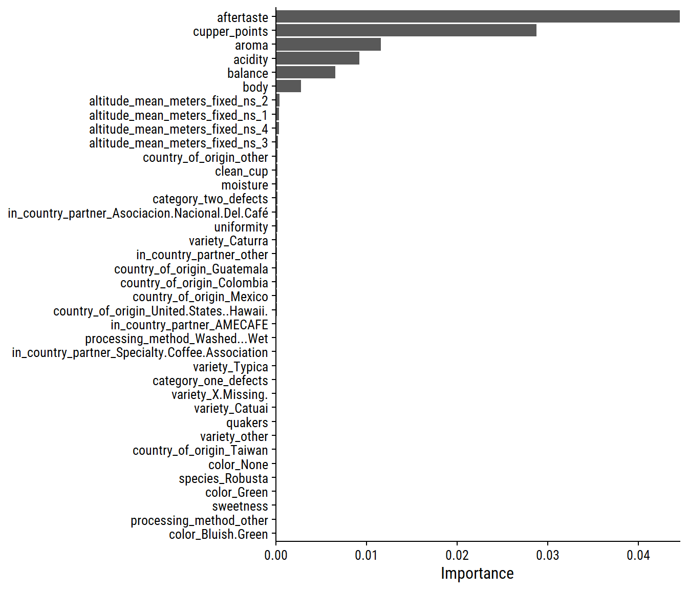
Even fewer variables were deemed important in this model compared to lasso.

Conclusion

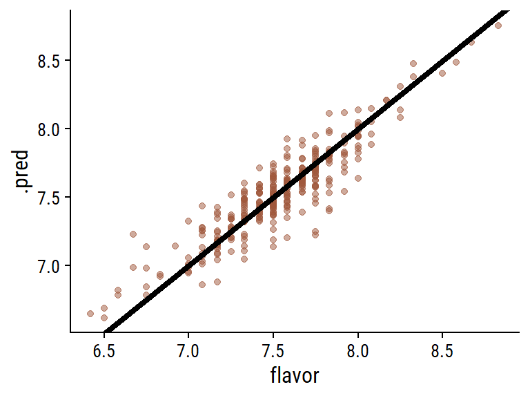
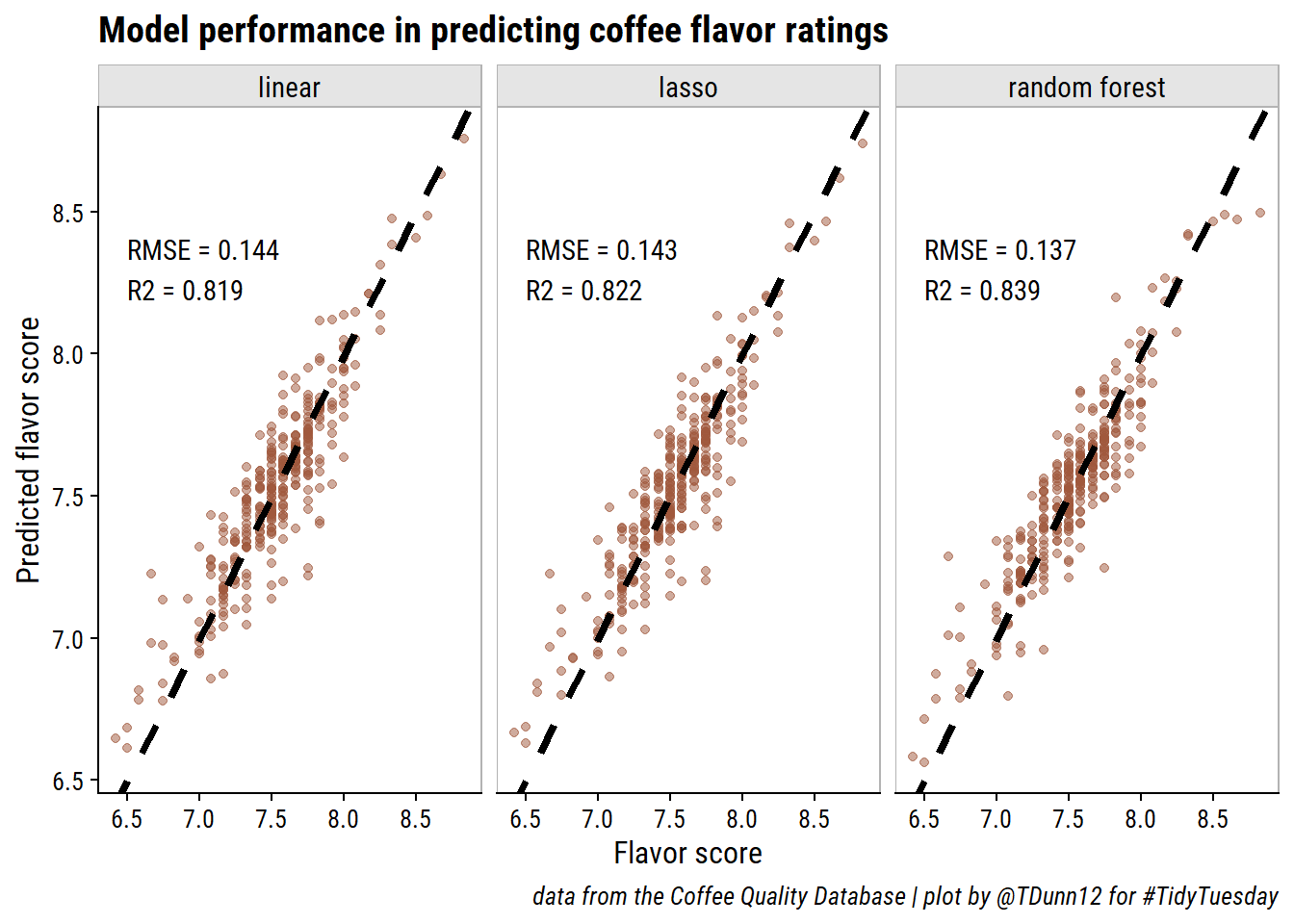
The random forest model was very slightly better in predicting coffee flavor, which I’ll summarize with a plot:

d <- bind_rows(
  mutate(collect_metrics(lm_fit), fit = "linear"),
  mutate(collect_metrics(lasso_fit), fit = "lasso"),
  mutate(collect_metrics(ranger_fit), fit = "random forest")
) %>%
  group_by(fit) %>%
  summarise(
    fit_metrics = glue::glue(
      "RMSE = {round(.estimate[.metric == 'rmse'], 3)}\n",
      "R2 = {round(.estimate[.metric == 'rsq'], 3)}"
    ),
    .groups = "drop"
  ) %>%
  left_join(
    bind_rows(
      mutate(collect_predictions(lm_fit), fit = "linear"),
      mutate(collect_predictions(lasso_fit), fit = "lasso"),
      mutate(collect_predictions(ranger_fit), fit = "random forest")
    ),
    by = "fit"
  ) %>%
  mutate(fit = factor(fit, levels = c("linear", "lasso", "random forest")))
d %>%
  ggplot(aes(x = flavor, y = .pred)) +
  geom_point(color = coffee_pal[1], alpha = 0.5) +
  geom_abline(slope = 1, intercept = 0, size = 1.5, lty = 2) +
  geom_text(data = . %>% distinct(fit, fit_metrics),
            aes(label = fit_metrics, x = 6.5, y = 8.3), hjust = 0) +
  facet_wrap(~fit, nrow = 1) +
  add_facet_borders() +
  labs(y = "Predicted flavor score", x = "Flavor score",
       title = "Model performance in predicting coffee flavor ratings",
       caption = paste0("data from the Coffee Quality Database | ",
                        "plot by @TDunn12 for #TidyTuesday"))

Reproducibility

Session info
 setting  value
 version  R version 4.2.1 (2022-06-23 ucrt)
 os       Windows 10 x64 (build 19044)
 system   x86_64, mingw32
 ui       RTerm
 language (EN)
 collate  English_Canada.utf8
 ctype    English_Canada.utf8
 tz       America/Curacao
 date     2022-10-27
 pandoc   2.18 @ C:/Program Files/RStudio/bin/quarto/bin/tools/ (via rmarkdown)
Git repository
Local:    main C:/Users/tdunn/Documents/tdunn-quarto
Remote:   main @ origin (https://github.com/taylordunn/tdunn-quarto.git)
Head:     [4eb5bf2] 2022-10-26: Added font import to style sheet

Source code, R environment

Reuse

Citation

BibTeX citation:
@online{dunn2020,
  author = {Dunn, Taylor},
  title = {TidyTuesday 2020 {Week} 28},
  date = {2020-07-12},
  url = {https://tdunn.ca/posts/2020-07-12-tidytuesday-2020-week-28},
  langid = {en}
}
For attribution, please cite this work as:
Dunn, Taylor. 2020. “TidyTuesday 2020 Week 28.” July 12, 2020. https://tdunn.ca/posts/2020-07-12-tidytuesday-2020-week-28.